District at the Frauenkirche Dresden
CLIENT
District at the Frauenkirche GmbH & Co. KG
PROGRAM
Offices, apartments, shops
COSTS 2,180,000 € gross
GFA 2,000 sqm
RESULTS
1st Prize competition by invitation,
service phases 1-5 HOAI
2002-2006
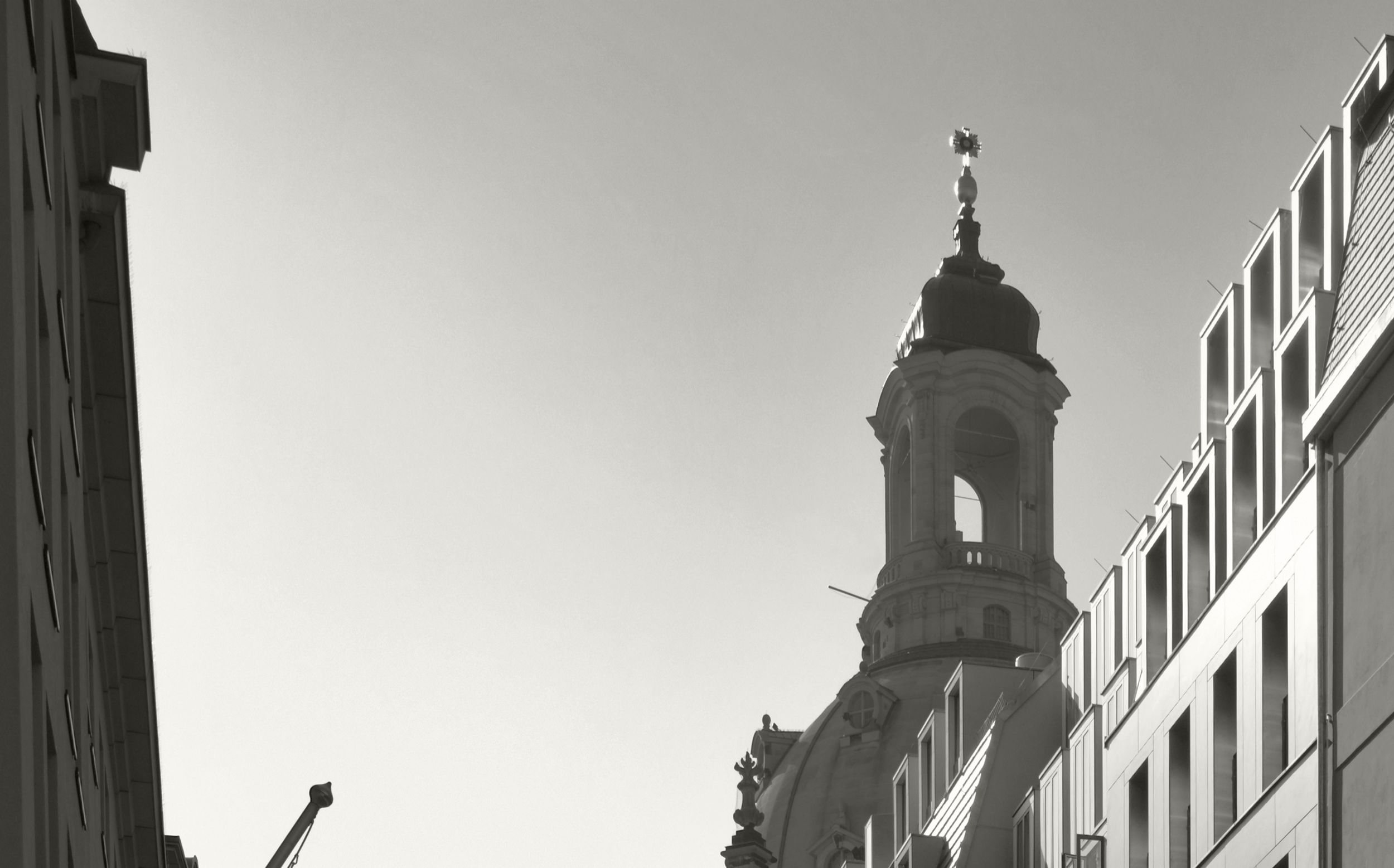
The district at the Frauenkirche is a block of landmarks, façade reconstructions and a few new buildings with a continuous shopping mall in the lower floors. Some streets were rebuilt according to the historical plans. Whereas several new buildings were built at Töpferstraße based on a design competition. The new residential and business building at Töpferstraße 4 / 6 creates the idea of two seperated building volumes on the former plot structure by different eves heights and fits in the picturesque detailed environment. The two plots were joined and are accessed together to get good usable retail space as well as generous floor plans in the upper levels. Maisonette apartments are located on the top floors. By many dormers a stimulating roof structure is created, which resembles a modern variation of the baroque roof landscape.
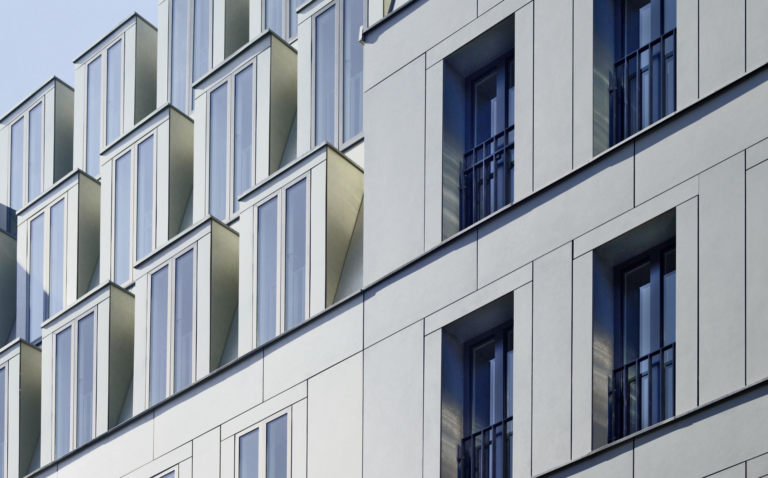
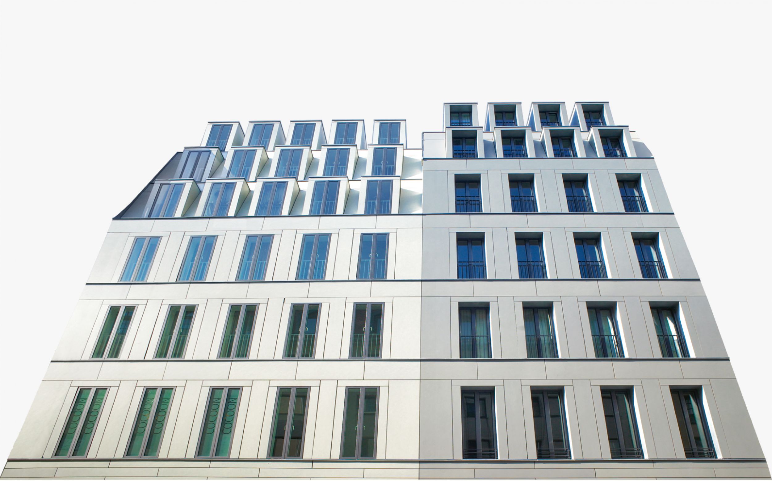
The two parts of the façade take up the narrow plot widths as well as design elements of the historical building structure through the window sizes and edging. When taking a closer look more precise details stand out. The window sizes and their arrangement are repeated back in the dormers. The precisely cut fiber cement panels of the façades oriented to the street (– accentuated in color for every house –) are emphasizing the narrow towering building structure by their vertical elongated formats on the upper floors. Whereas in the pedestal area they appear as a rustication by their horizontal division. An exciting modern façade is achieved despite the extensive design specifications through the different arrangement of less identical elements. In one part of the building the windows are situated on the outside, flush with the façade. The other part is made of the same façade material and is based on the same structure – but here the windows have a deep soffit and outside railing.
The two parts of the façade take up the narrow plot widths as well as design elements of the historical building structure through the window sizes and edging. When taking a closer look more precise details stand out. The window sizes and their arrangement are repeated back in the dormers. The precisely cut fiber cement panels of the façades oriented to the street (– accentuated in color for every house –) are emphasizing the narrow towering building structure by their vertical elongated formats on the upper floors. Whereas in the pedestal area they appear as a rustication by their horizontal division. An exciting modern façade is achieved despite the extensive design specifications through the different arrangement of less identical elements. In one part of the building the windows are situated on the outside, flush with the façade. The other part is made of the same façade material and is based on the same structure – but here the windows have a deep soffit and outside railing.


